It’s only been 1 week since the release of 3.0, but we’ve got another update for you: 3.1. Download it now on http://powerlevelstudios.com.
As you can expect, it’s not a very big update, but it does have some nice improvements:
A Title Screen
Starting the game from outside the vault was always a terrible experience. Like most games, we added a title screen. The background is a video of the game playing. We’re experimenting with the idea. Currently, it’s only a placeholder video.
As you can see from the screenshot below, we also added a Latest News section. That way you’re always up to date with the latest development.
We’ll add an Options menu there in the future.
Much better Saved Game selection
We’re showing the player’s level, their equipped loot and the top 10 souls they own. The equipped loot will obviously look better once we have actual icons for each loot.
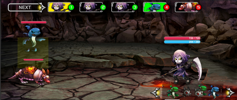
Timeline Target Highlighting
By moving the cursor to select a monster, you can see where they sit in the timeline, making planning your attacks much easier (see how the Bubbly Fish’s timeline icon is coloured green?).
Sounds!
We finally put sounds in all the menus. The game feels a lot more polished simply by adding those. The sounds are not final yet though.
What do you think?
Are you looking forward to the new changes? Do you prefer weekly little updates like this one or big monthly updates like the previous 2 months?
What improvement would you like to see in a small weekly update like that?


